Resilience and the City
Deciphering the pandemic’s visual language
The pandemic produced a new visual language around uncertainty and vulnerability. A podcast by Peg Rawes unpicks what this language is doing and where it comes from.

Peg Rawes is Professor of Architecture and Philosophy at The Bartlett School of Architecture; an interdisciplinary architectural historian whose work focuses on relational architectural ecologies. She made a key contribution to the podcast, ‘Life in the Time of Coronavirus’ examining one of the primary visual aspects of pandemic life. Having been asked to speculate on the concepts of immunity and immunisation, Rawes explores the use of graphic technologies to predict, project and ostensibly to protect.

“We have become used,” she says, “to a whole new visual language of certainty and prediction.” The graphs we once saw on daily news reports, and only marginally less often now, show that the pandemic is an exemplary form of biopolitical management. The way in which the UK healthcare and economic crisis is primarily understood is in this way: how resources have been deployed and science used. The naming of these processes have their own architecture: flattening the curve being the best example.
During the podcast, Rawes looks at a sequence of key maps and graphs. Addressing Buckminster Fuller’s problematic Dymaxion maps, Rawes notes that they were created when Fuller was working as a technical consultant for Fortune magazine. His maps, far from offering a more egalitarian way of seeing the world as they are supposed to, model technological and political certainty. Rawes also discusses the artist Tom Corby’s biometric visualisations that track his own long-term illness and the philosopher Gillian Howie’s meditations on living with dying.
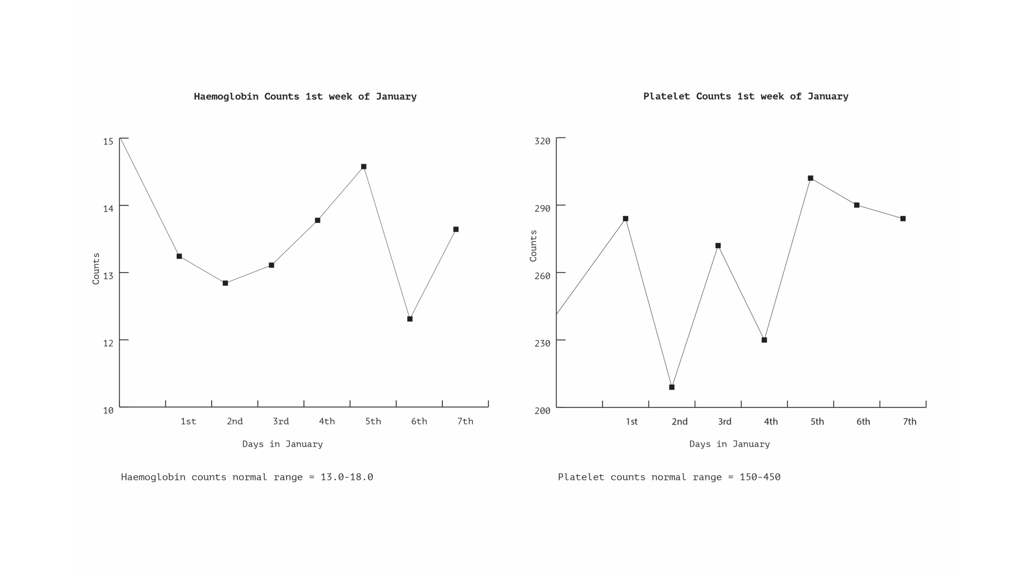
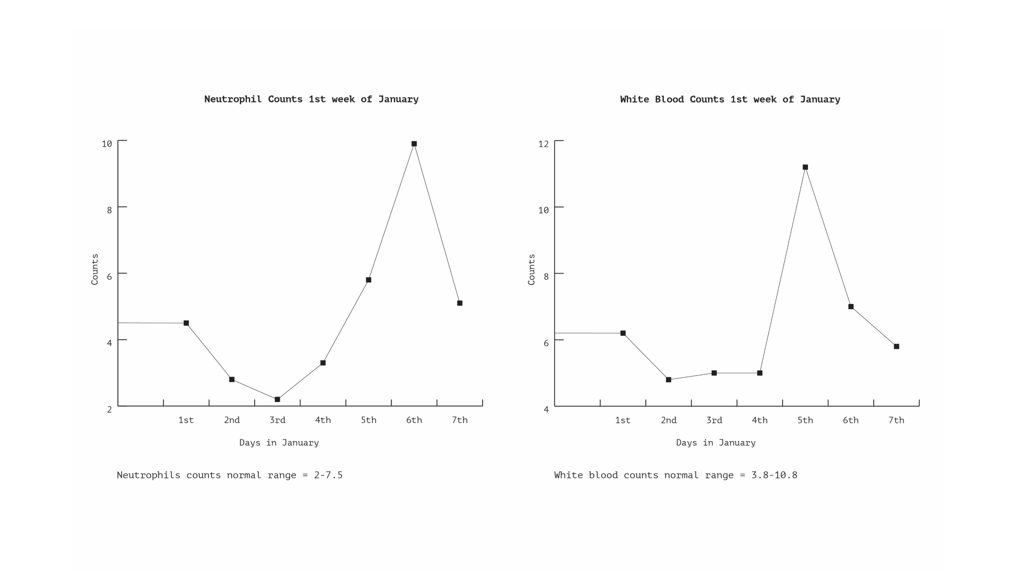
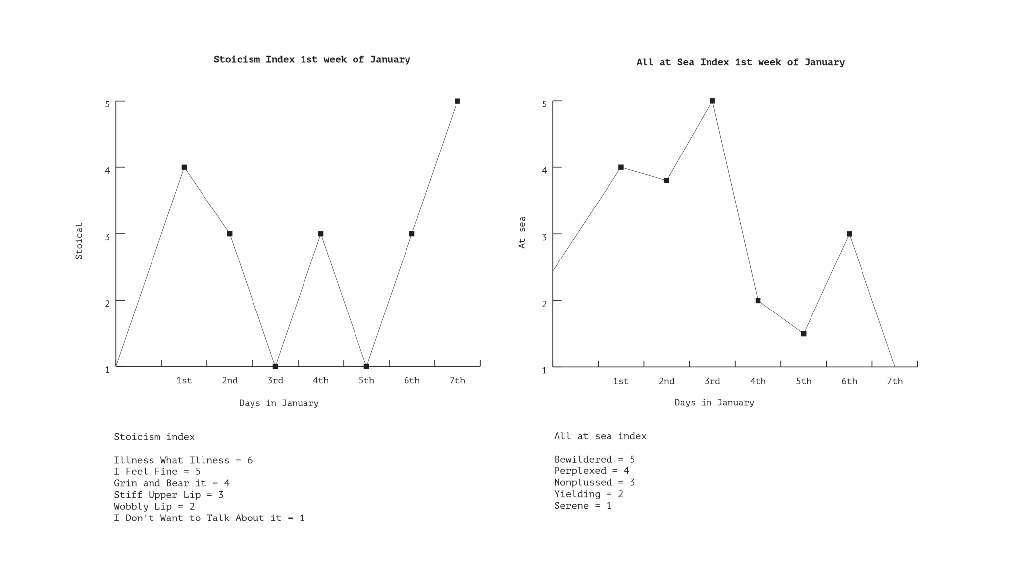
Blood and Bones narrates Corby’s experience of serious illness using a combination of data processing, imaging and photographic documentation. He designed a range of methods to track and measure his illness. Alongside normal blood, pain and other bio markers, he invented or adapted a range of other data indexes through which he could keep track of and communicate his experiences including: ‘stoicism trackers’; the ‘all at sea index’; ‘control’, and ‘mood’.
Both Corby’s and Howie’s work address the pervasive anxiety the virus has unleashed, as well as highlighting ongoing issues around representation, vulnerability and mortality.
Images from Blood and Bones, by Tom Corby. Courtesy of the artist. Blood and Bones narrates Corby’s serious illness using data processing, imaging and photography.